ProjectPrudential Retirement “Money Out” Experience
RoleLead Product Designer aligning product, business, and development teams while working closely with our partners at McKinsey to create a new agile way of working at Prudential.
ResponsibilitiesUX Design, UI Design, Strategy, Team Alignment, Workshop Facilitation, Research & Testing, Information Architecture
Project BackgroundCreate an experience in which customers can access money from their retirement accounts based on informed decisions and without unnecessary friction. This was a four-month pilot project not only focused on the work but on how we tackled creative projects at Prudential.

Part 1 // Understanding the ProblemThe Problem
Customers want to be able to self-serve in retirement but often don’t feel comfortable completing a withdrawal online. Sometimes that’s because they’re not finding enough information about their options to give them the confidence to proceed, or they get part of the way through and still have questions, so they end up placing a call.
This results in nearly 60% of withdrawals happening by phone at a cost of $4.5 million per year to the company.
Walking the team through early iterations of the entire journey and what we were planning.
Part 2 // IterationFinding the Right Solution
We worked in weekly sprints alongside the development team. Each week we would iterate based on customer feedback. Design and then test with real customers. Each time we gathered feedback, we synthesized the information and put it back in the design.

I would split the weekly work up into three categories. Strategy: defining what we’ll be working on 3 to 4 sprints from now, doing the necessary research and alignment work with the business. UX: figuring out the structure, architecture and flow for new features of the project. Testing with customers even in rough wireframe form. UI: putting together the developer ready files for handoff and working closely with the team through the final interactions.
Mapping out the experience and the paths various user types will take. Adding some higher fidelity to that map and beginning to add screen designs to the map. High Fidelity designs for each screen being used for the development team to build out the experience. Determining how the money out experience will fit into the larger retirement product structure. Part 3 // Continuous TestingEach Iteration was tested with our customers on a weekly basis
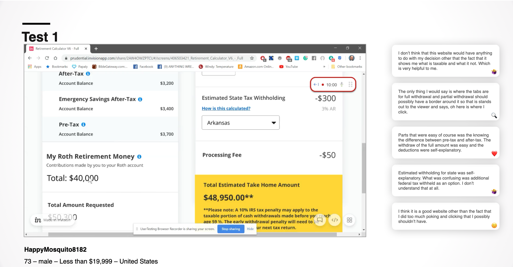
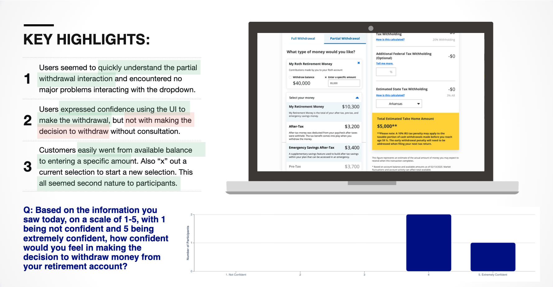
Every aspect of the experience we built was continuously tested with our customer base. Since this was during a pandemic we leveraged the capabilities of UserTesting.com to conduct and analyze user testing and needs finding results. After each test, I would present to the senior leadership team on the outcomes and best next steps. We used these results to continuously improve our design, language and flows. Below are some of the testing results presented to the team.
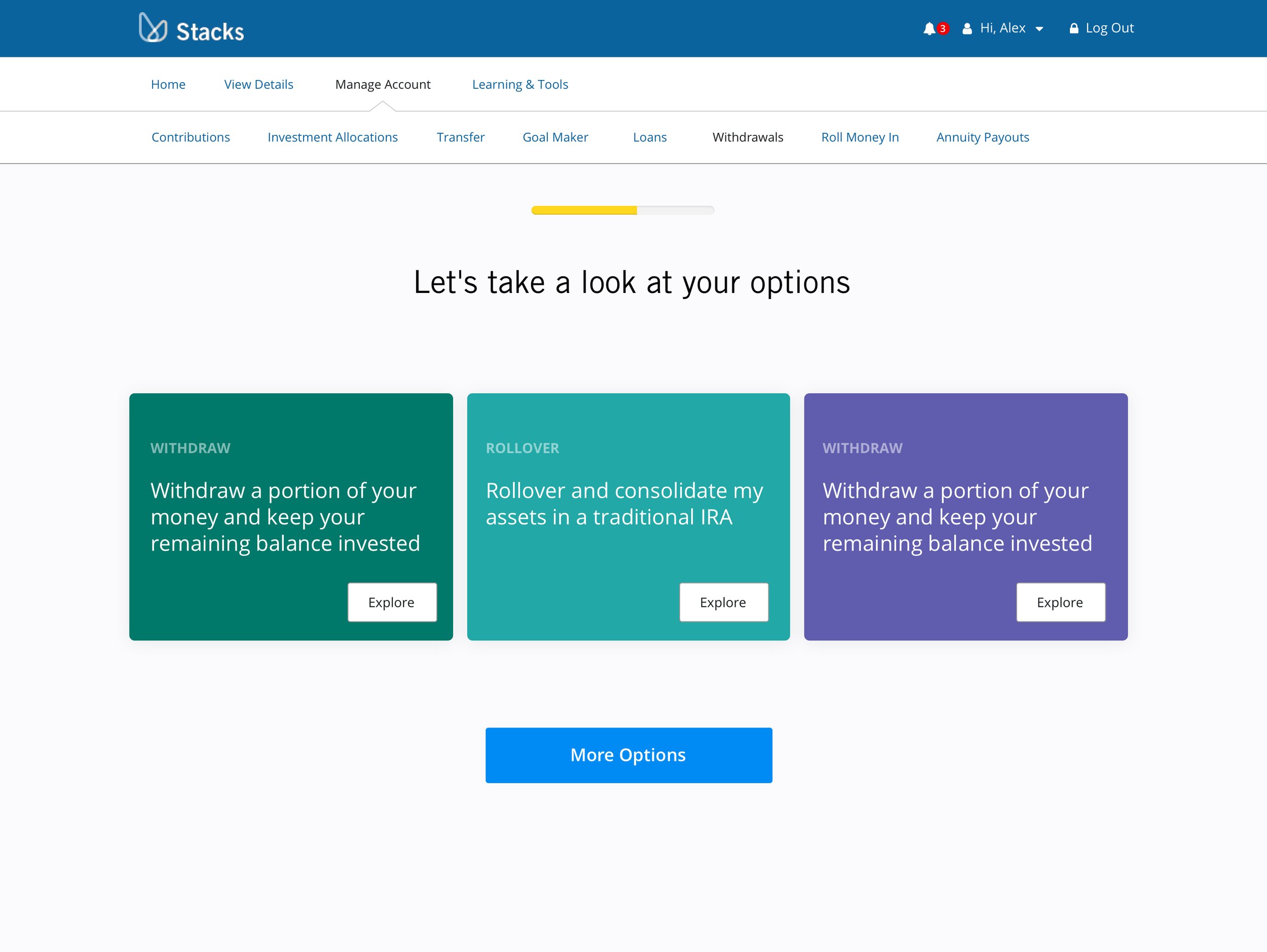
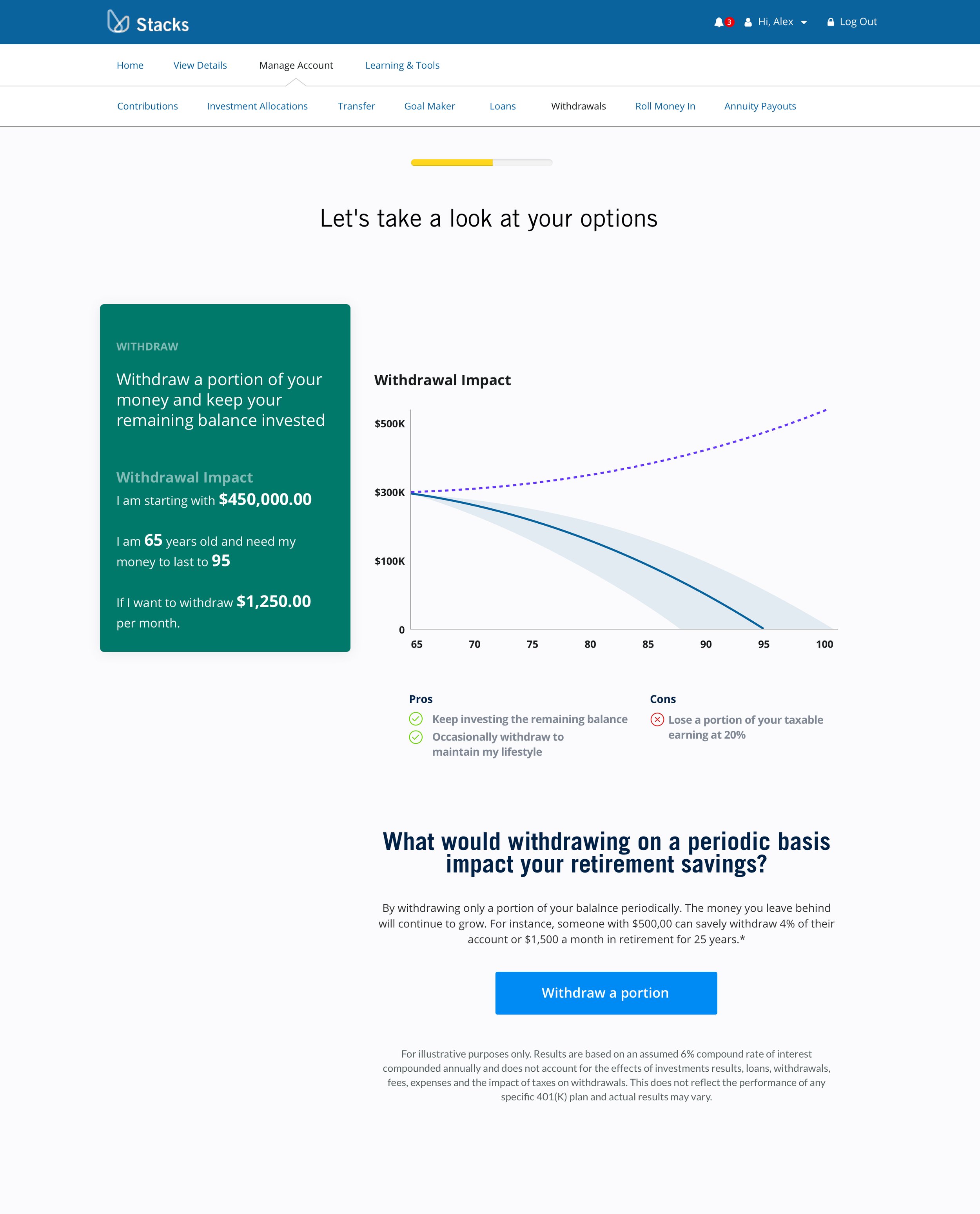
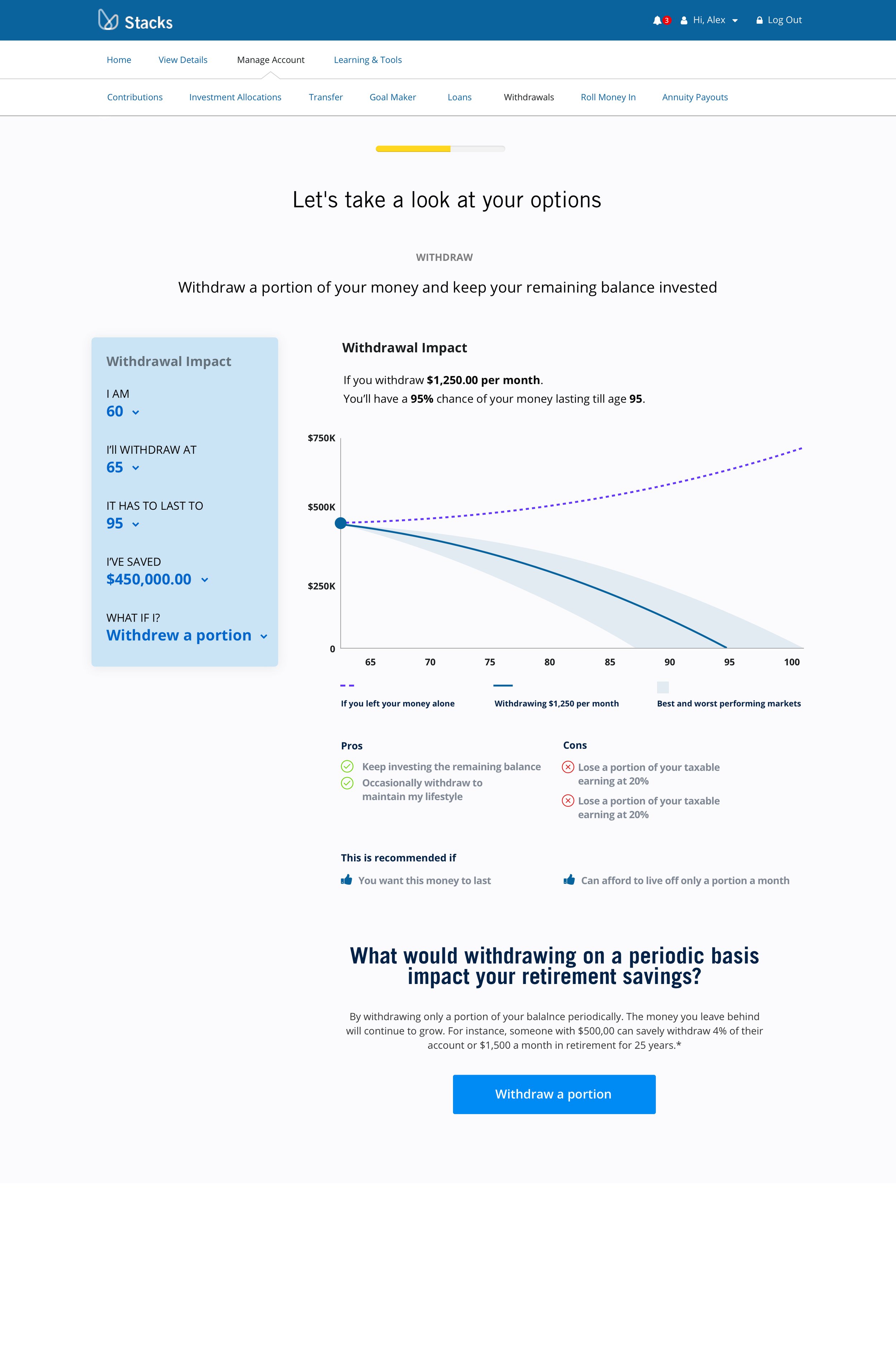
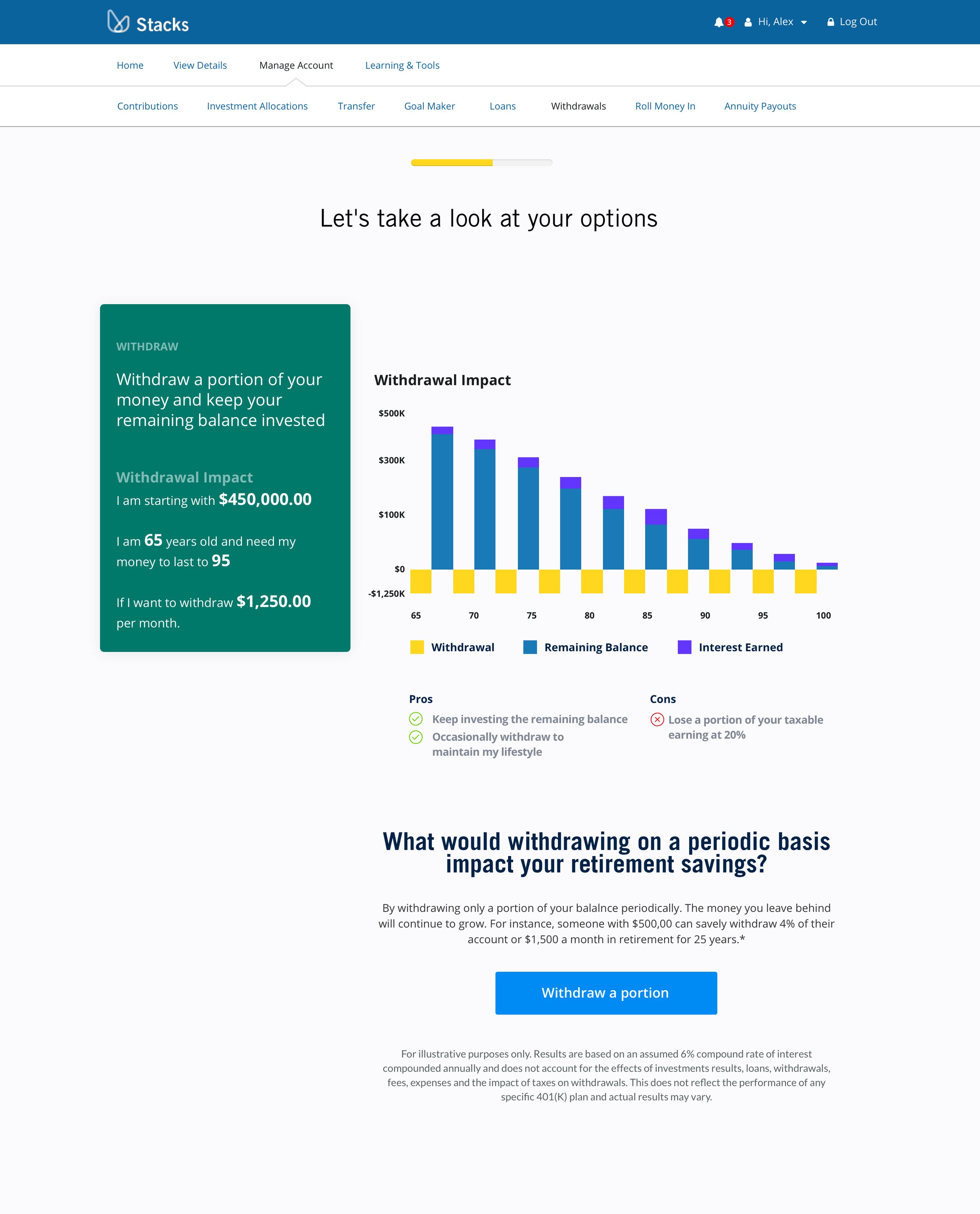
Here are some of the Design Iterations and Experiments





Part 4 // Final DesignsFinal Designs and Results
There was a unique redesign happening at Prudential at the time of this project where we were both updating our design system to a more modern design at the same time as redesigning a lot of our experiences. Below are some examples of where the design for this experience ended up along with some results.
Final Desktop DesignFinal Mobile DesignVideo of final prototypeNotable Project Outcomes
Tax Impact Calculator
Shows the user in real time what they will be taking home. Gives them the ability to withhold more at the federal level.
One Click Acceptance
Accepting disclosures was typically a chore in Prudential products. We worked with the law team to get the process down from multiple clicks for disclosures on multiple pages to just one click on just one page.
Human Translation
Most Prudential experiences were also incredibly verbose and overly complex. We worked closely with the copy and law teams to break that complex information down into understandable chunks. This was extremely well received in all our user testing.


