ProjectAnalytic Software UX/UI Design Evolution for Aon Modern Survey
RoleWork with our users in order to understand their pain points and reimagine an integral piece of our platform. Involved from the initial user research, I worked closely with the executive team iterating on prototypes and running user testing sessions both internally & externally.
ResponsibilitiesUX Design, UI Design, Strategy, Team building, Design Systems, Workshop Facilitation, Research & Testing, Information Architecture. Front End development using HTML & CSS
Project BackgroundInformation Architecture for an Integrated Aon + Modern Survey tool.
Midway into my time at Aon, it was announced we had purchased a competitor and like minded engagement enthusiasts, Modern Survey. Our goal was to find a way to Integrate the design, engagement philosophies, technology and methodologies into one cohesive software suite. Look at both companies overall information architecture and user flows. Combine them into Design Concepts for and updated Employee Engagement Platform Suite.
Aon Modern Survey Combined Integrated Site Architecture
Aon VIA Site Architecture
Modern Survey Site Architecture
Getting to know our clientsUser Personas
Use Design Thinking to get to know our users on a personal basis. Let their needs and our observations lead the product roadmap instead of releasing features with little customer value or insight. We created a customer group with some of our top clients.


Let's do itMVP Dashboard Design.
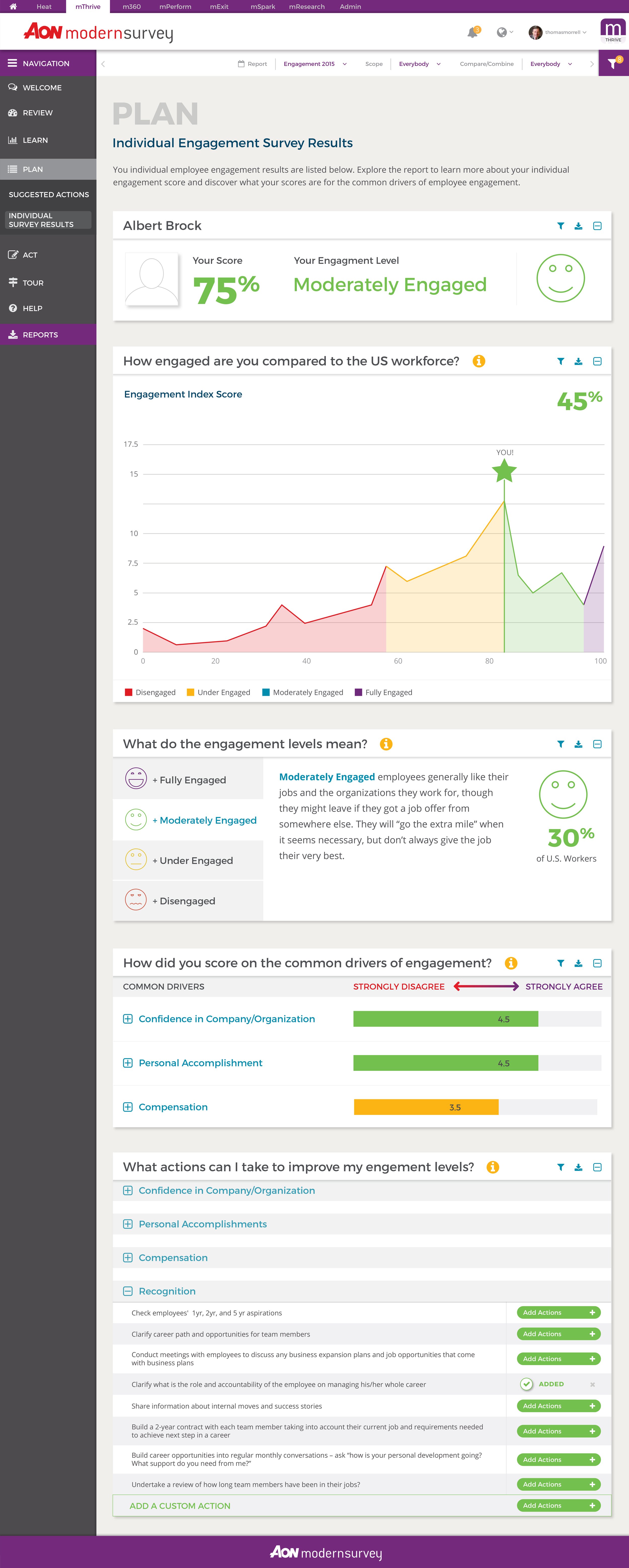
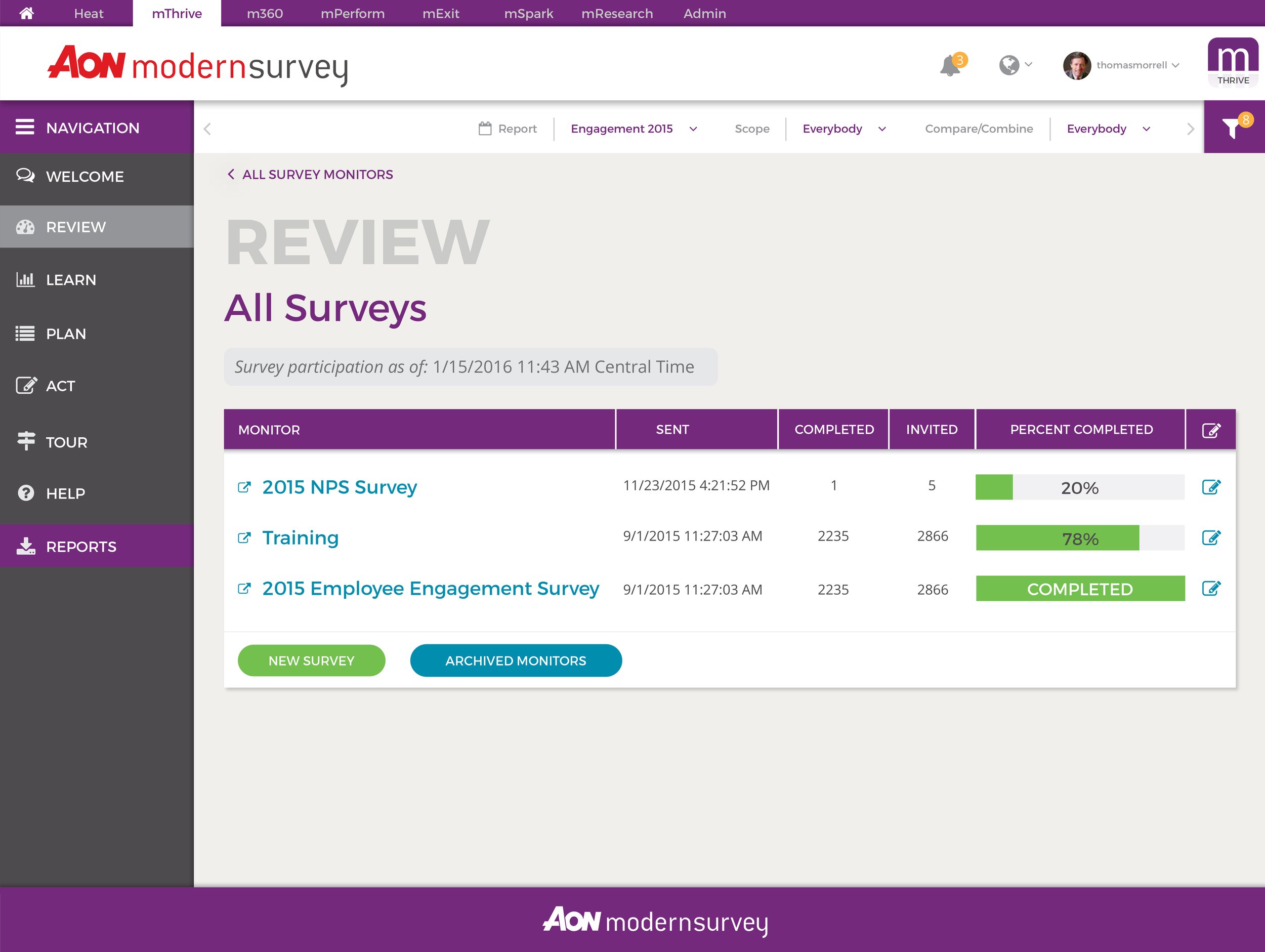
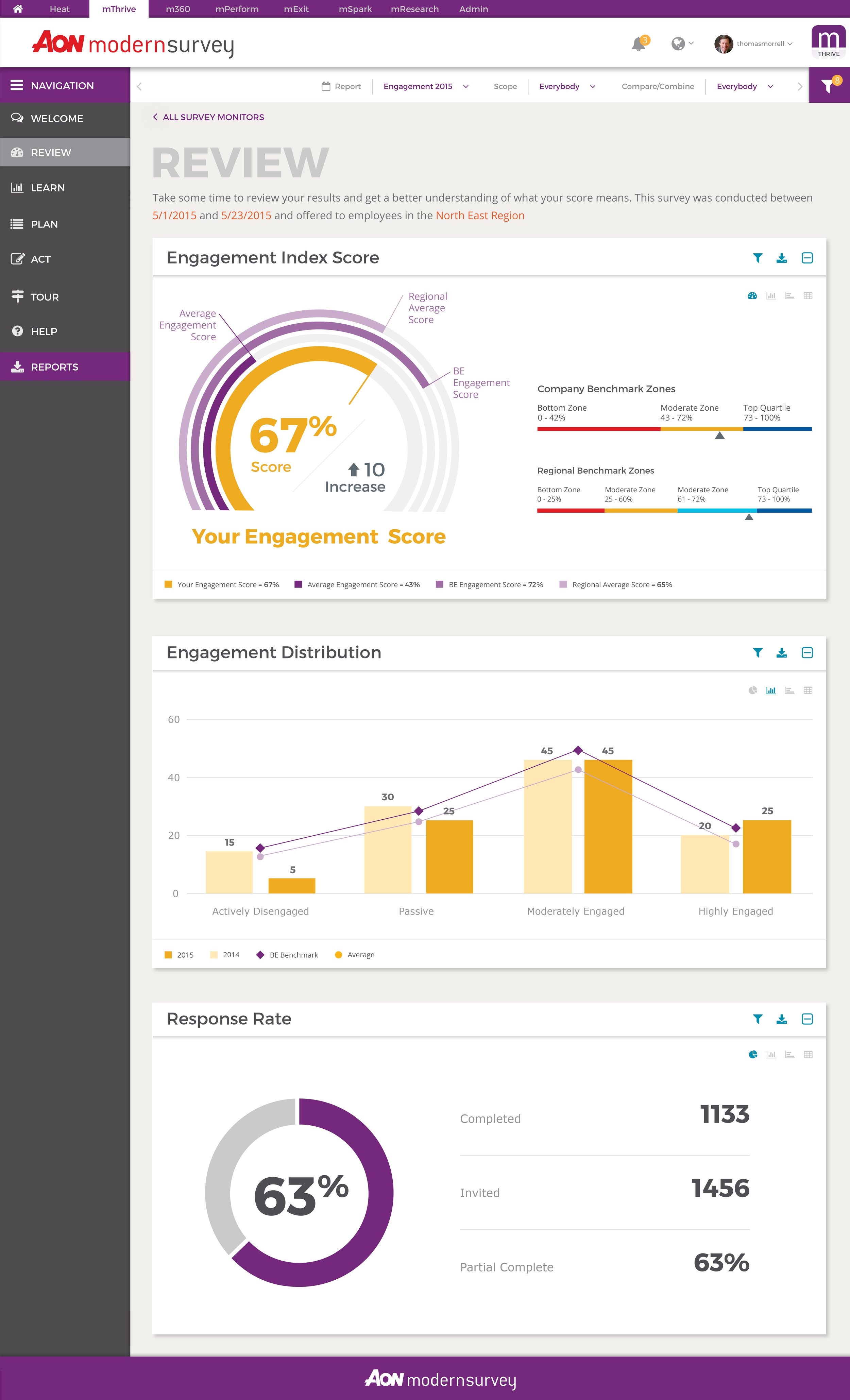
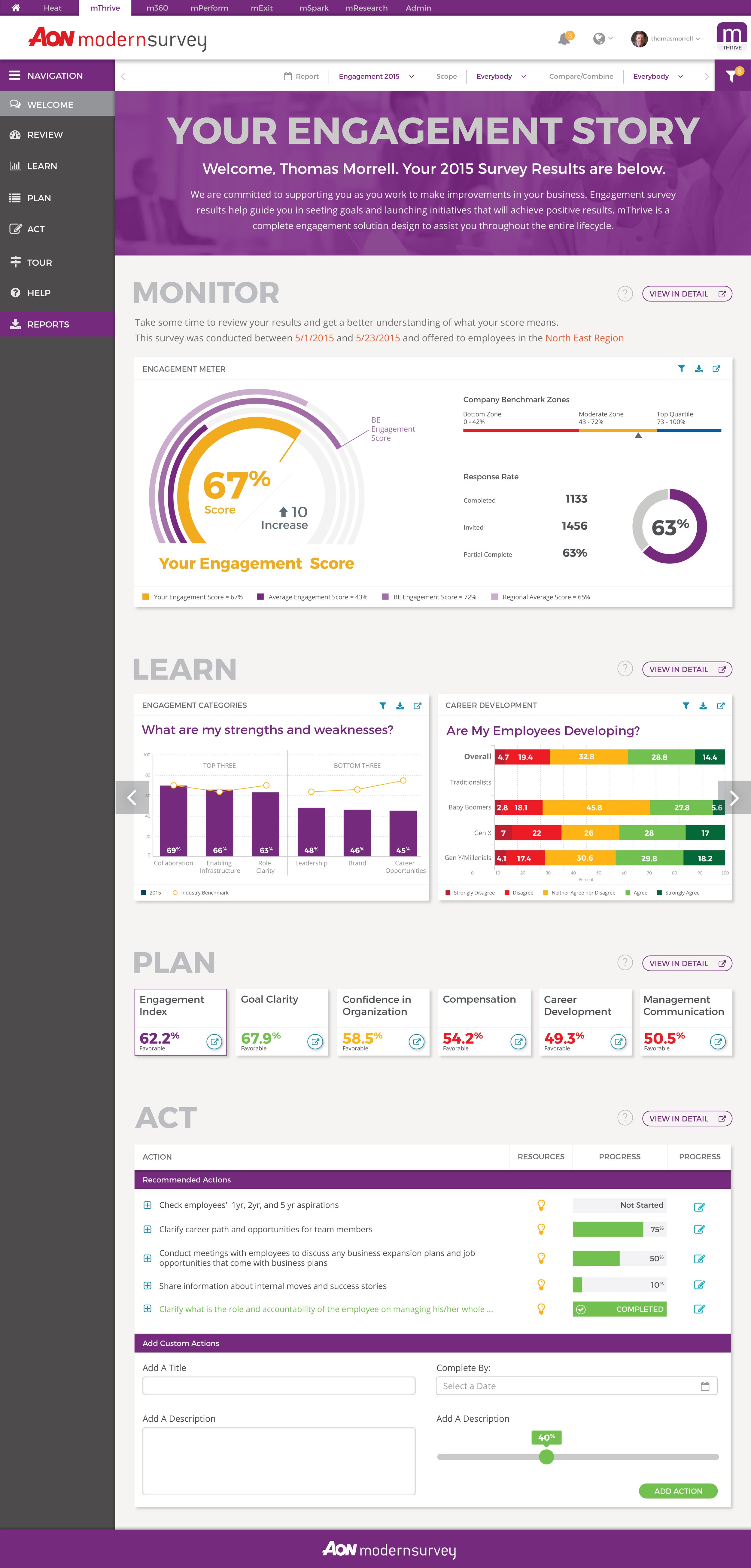
Fitting a total redesign into the product roadmap was not going to work for our time to delivery. The team was tasked to integrate the VIA Dashboard into the already existing Modern Survey Site Structure and Design. I worked with the talented design thinkers and developers at Modern Survey to integrate the two engagement methodologies into the design patterns already established.
Adding Critical FeaturesFilter, Compare, Combine, Export.
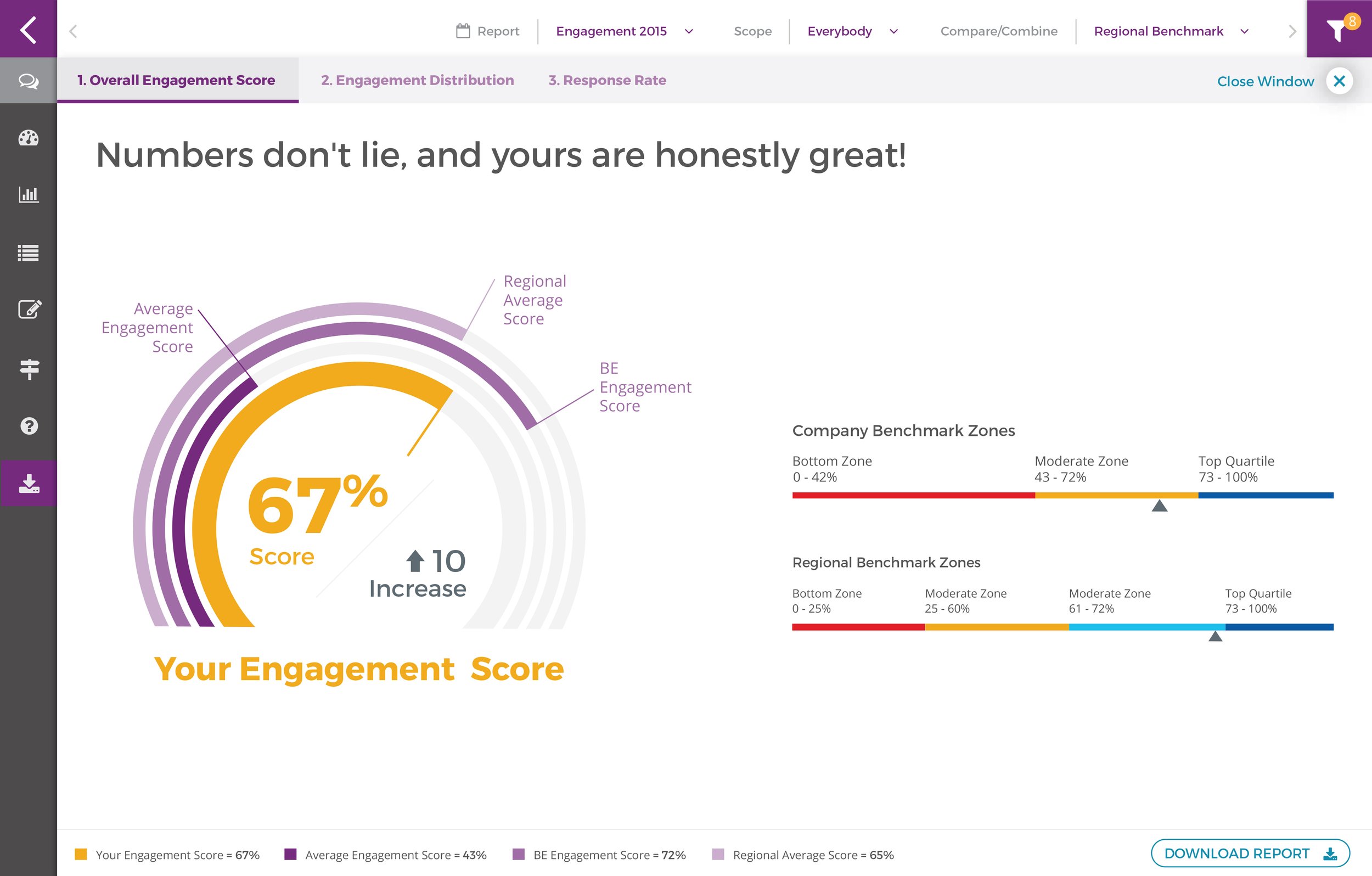
Redesign the fundamental way that users filter and compare data plus how they export and present their findings to their teams. One of the biggest findings we had in our research was that users were increasingly confused about where they could filter or compare their data. The UI was not informative or centralized for handling these types of questions. This redesign put everything in one place and allowed for filters to follow the user throughout the platform in order to reduce rework.
The other biggest user issue we found in our research was the fact that users desperately missed PowerPoint exports. Yes, you heard that right! People missed PowerPoint exports. We designed, tested, and built not only an export flow, but the actual PPT export and also an operations admin panel to set up these exports for clients.
Filter, Combine, Compare. Powerpoint ExportsPrint ExportsInnovationDashboard Iterations and Redesign.
We created a customer group with some of our top clients like HP, Swiss Re, Merck, Walgreens, McKesson, and Marriott. We shared prototypes of new features, tested with the group, and took their feedback into account in our iterative product updates.
Usability testing lets the design and development teams identify problems before they are coded. We tested our ideas with our clients each step of the way. From sketches to final high fidelity prototypes.
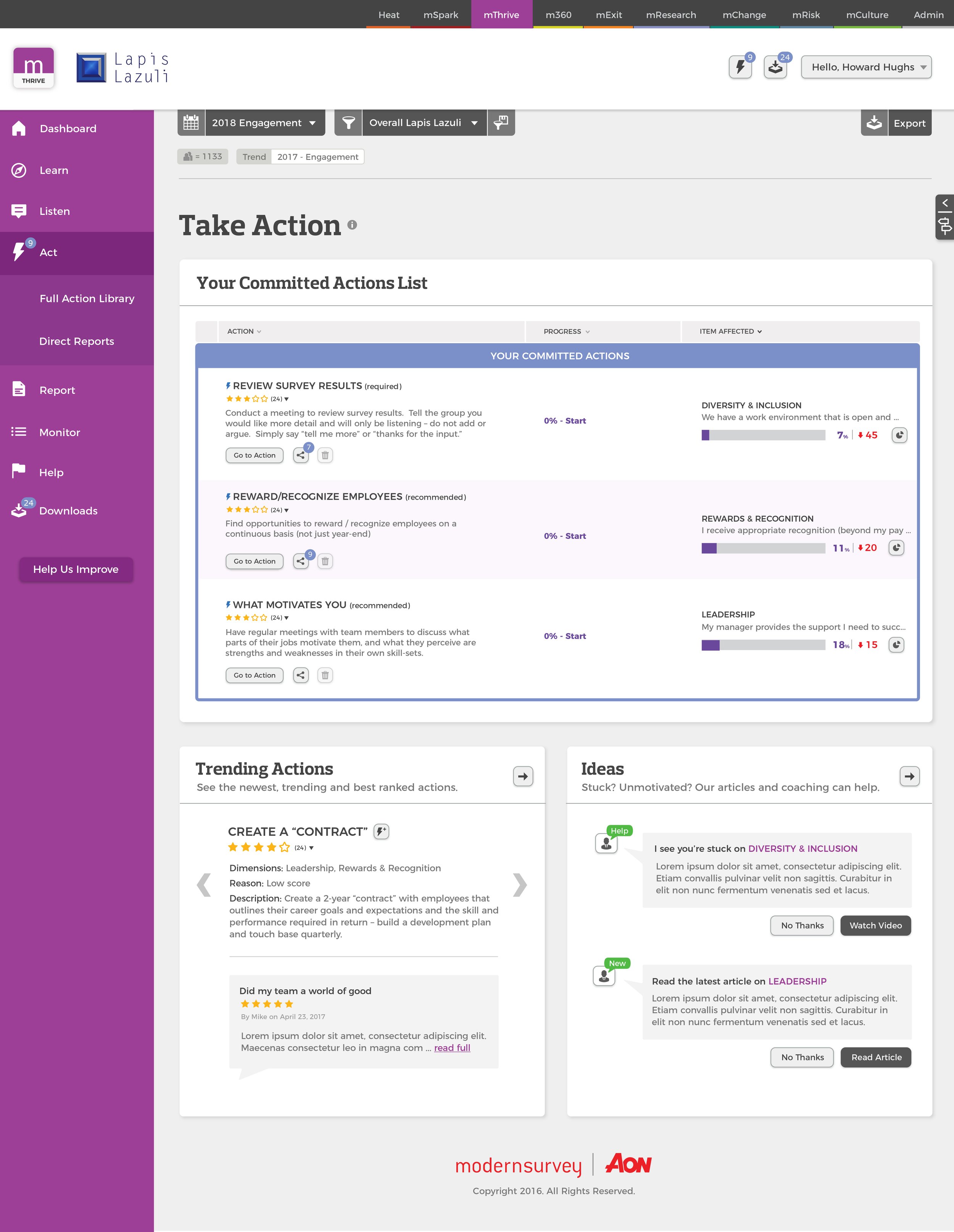
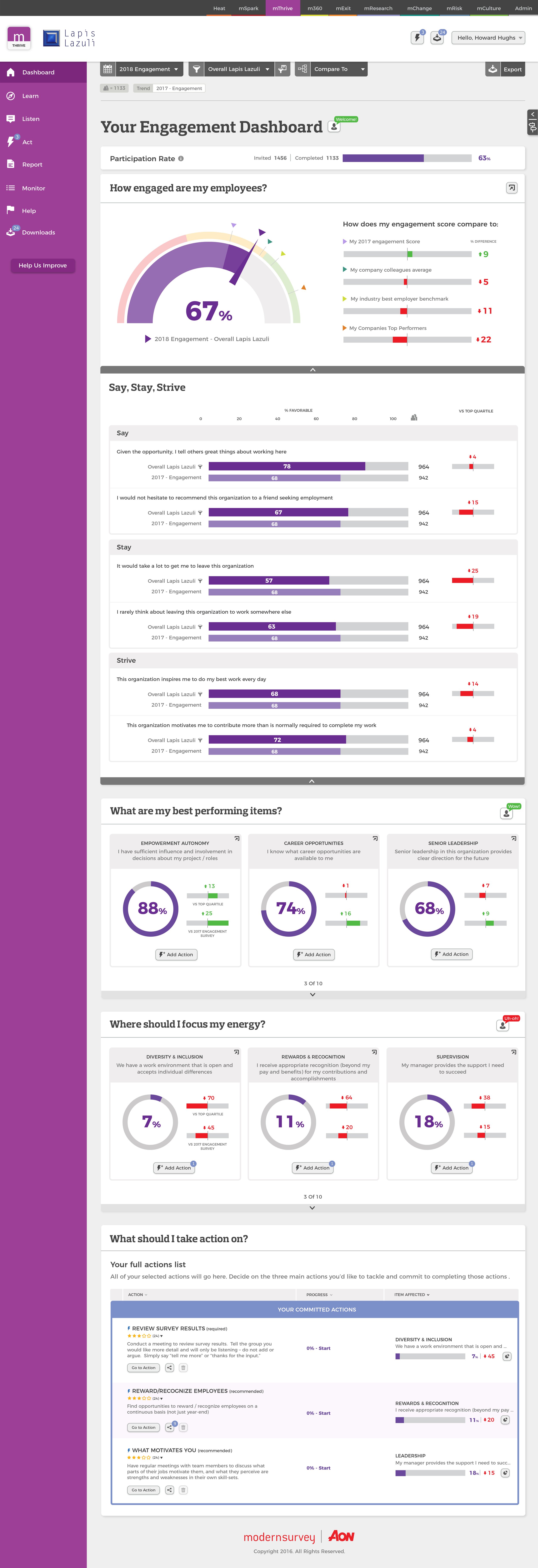
The Final Outcome
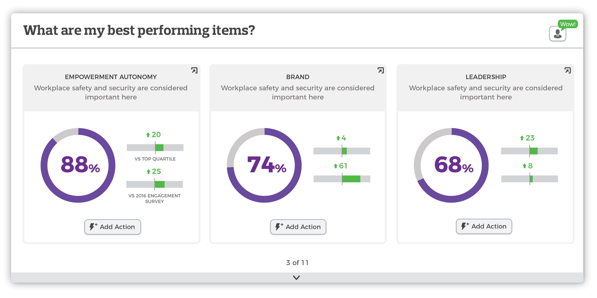
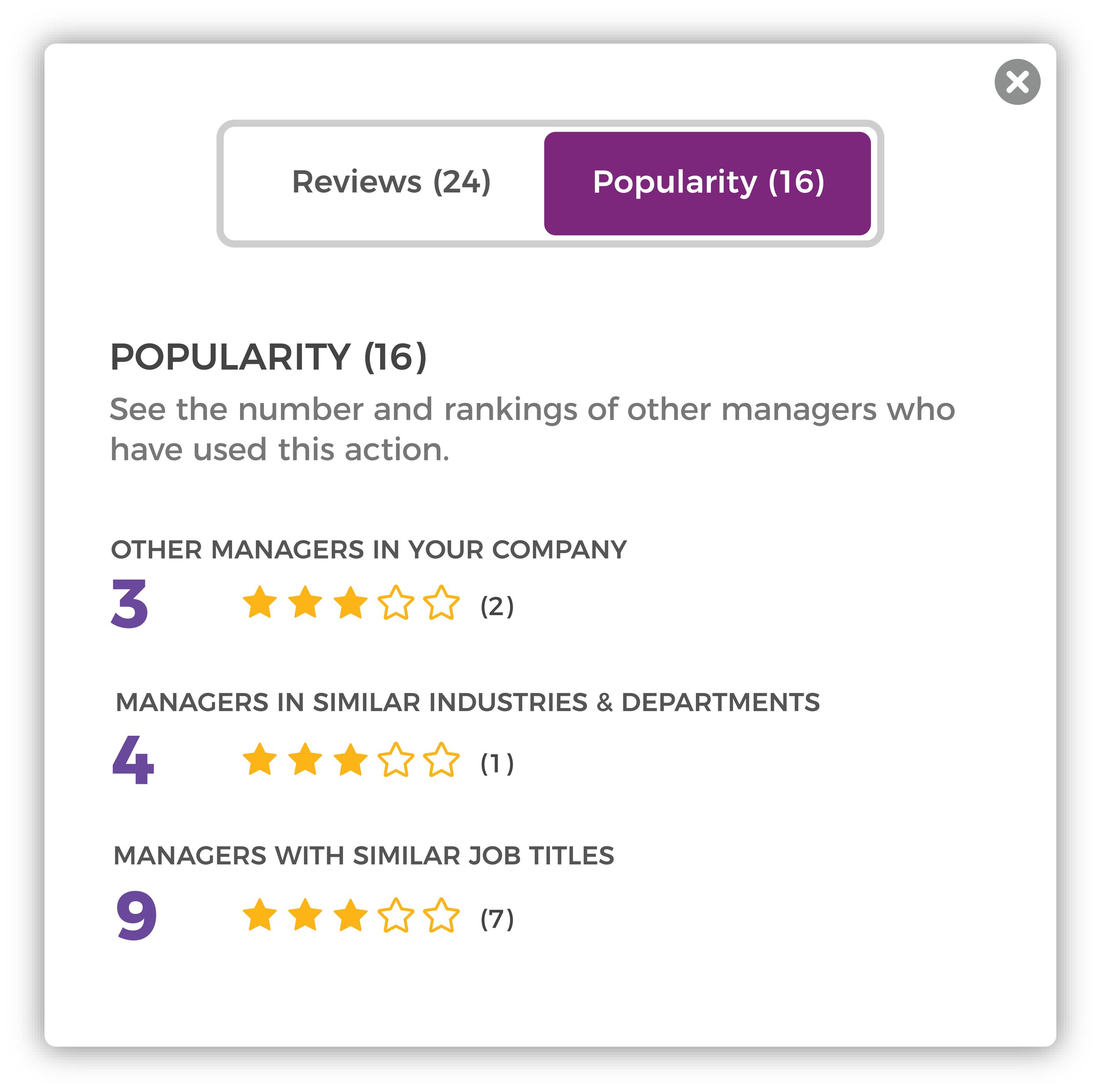
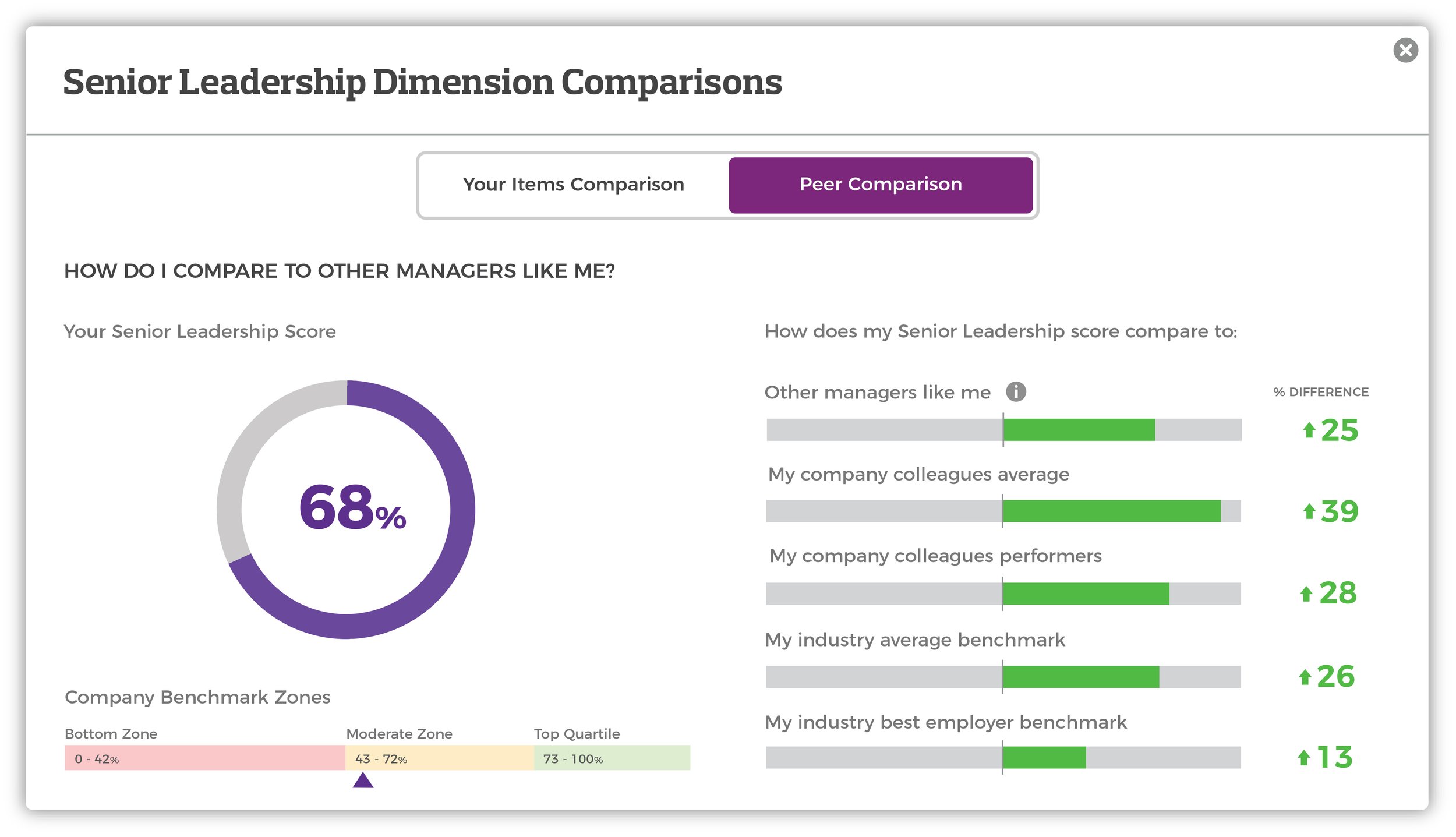
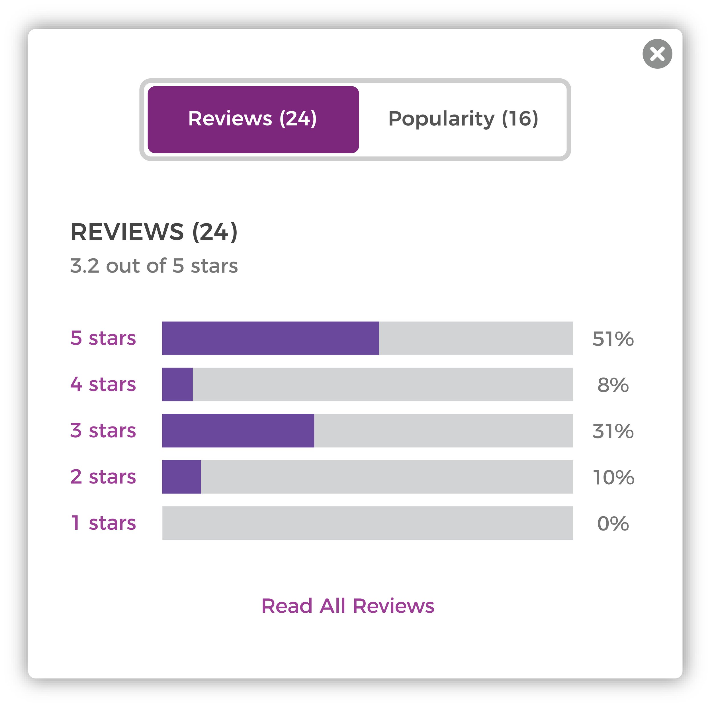

IDeasIterate, Iterate, Iterate.
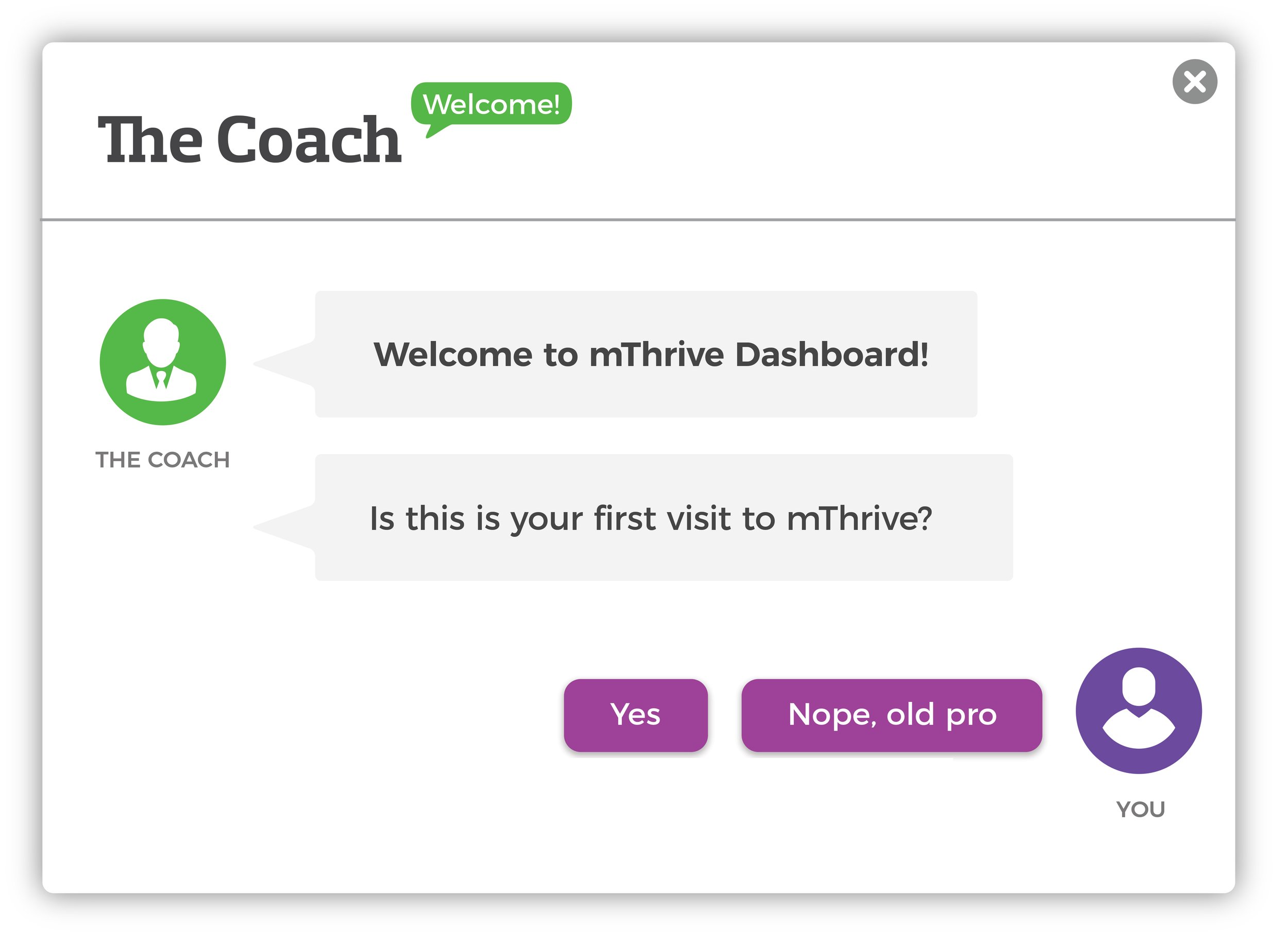
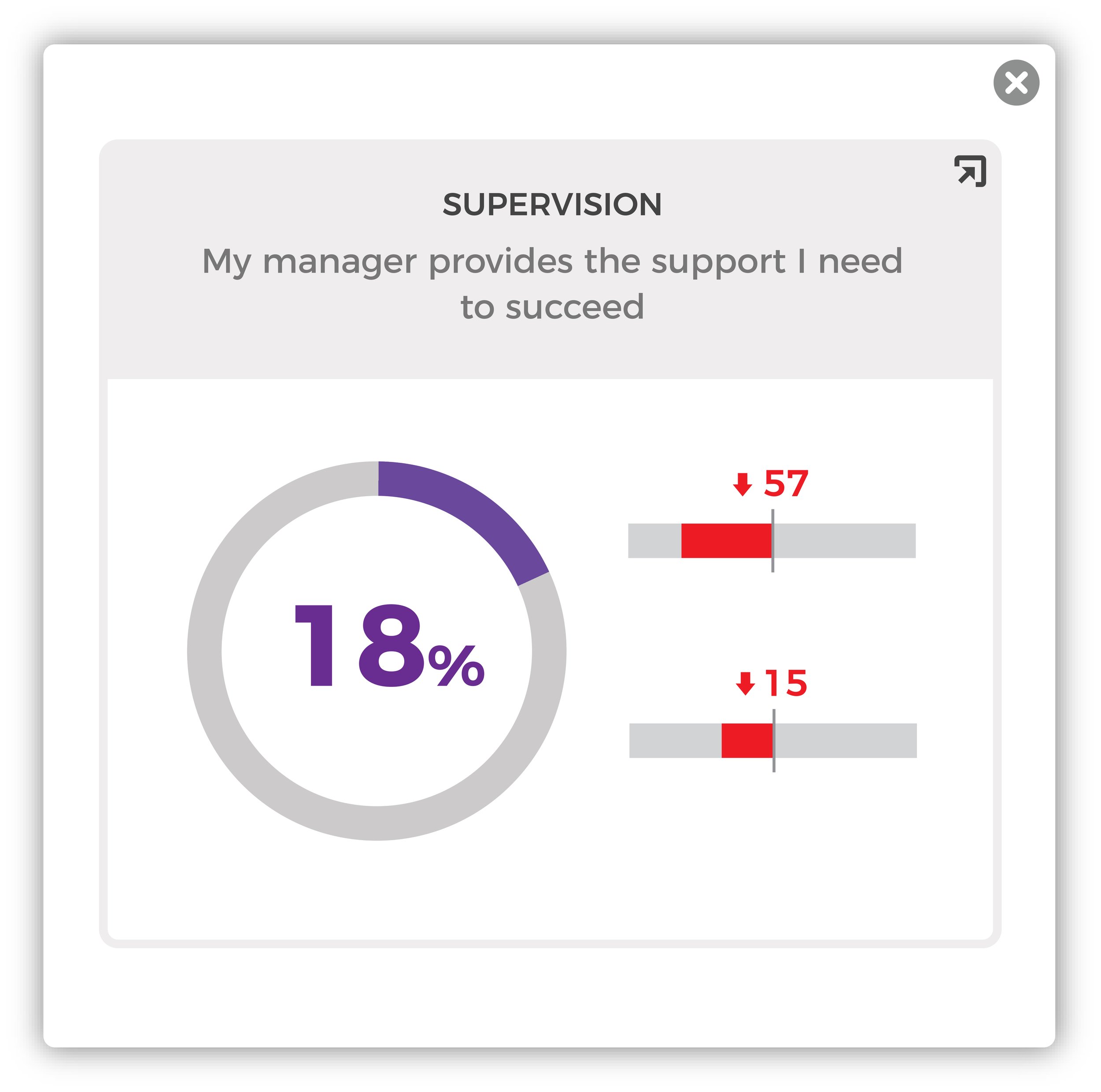
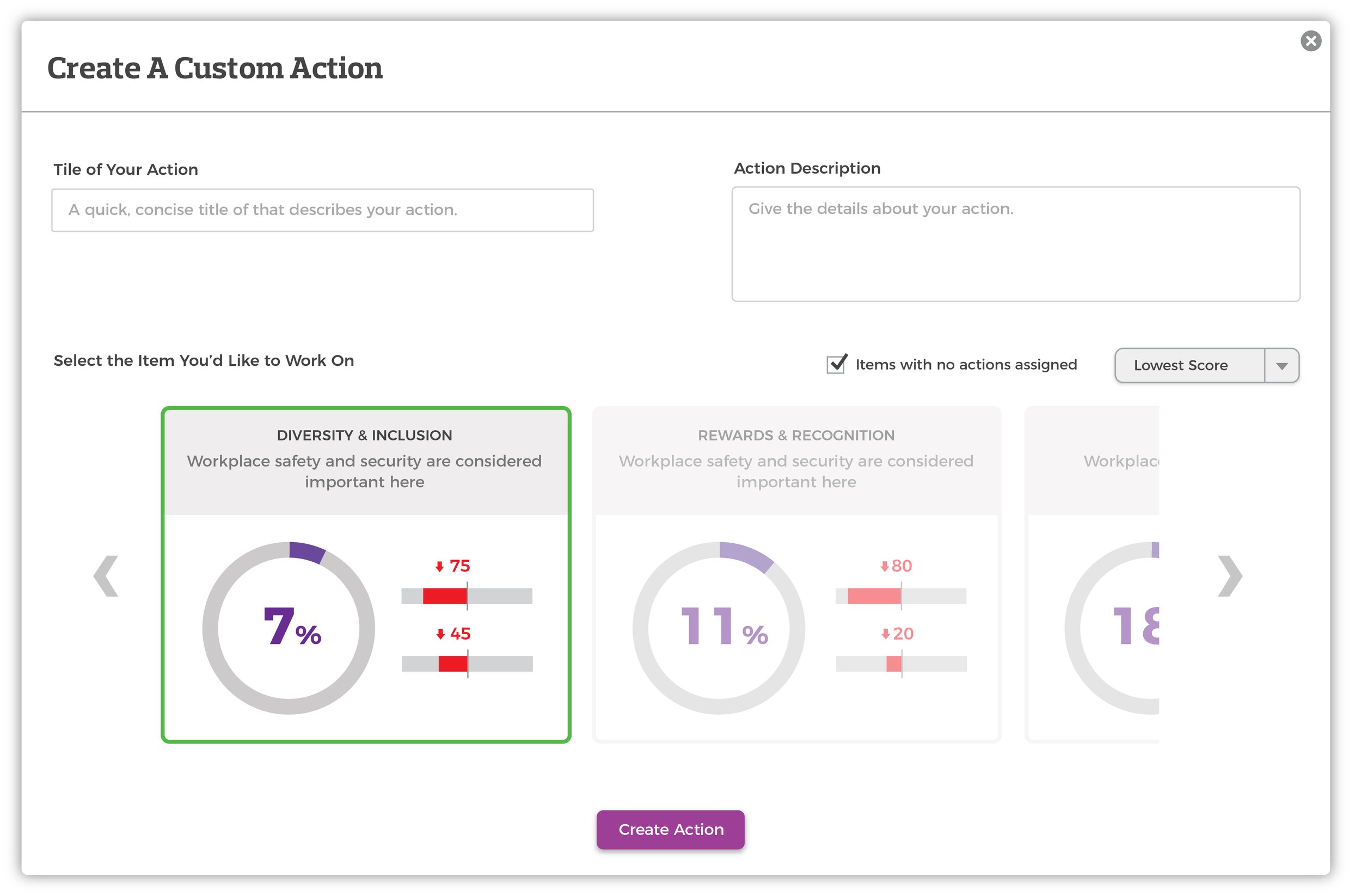
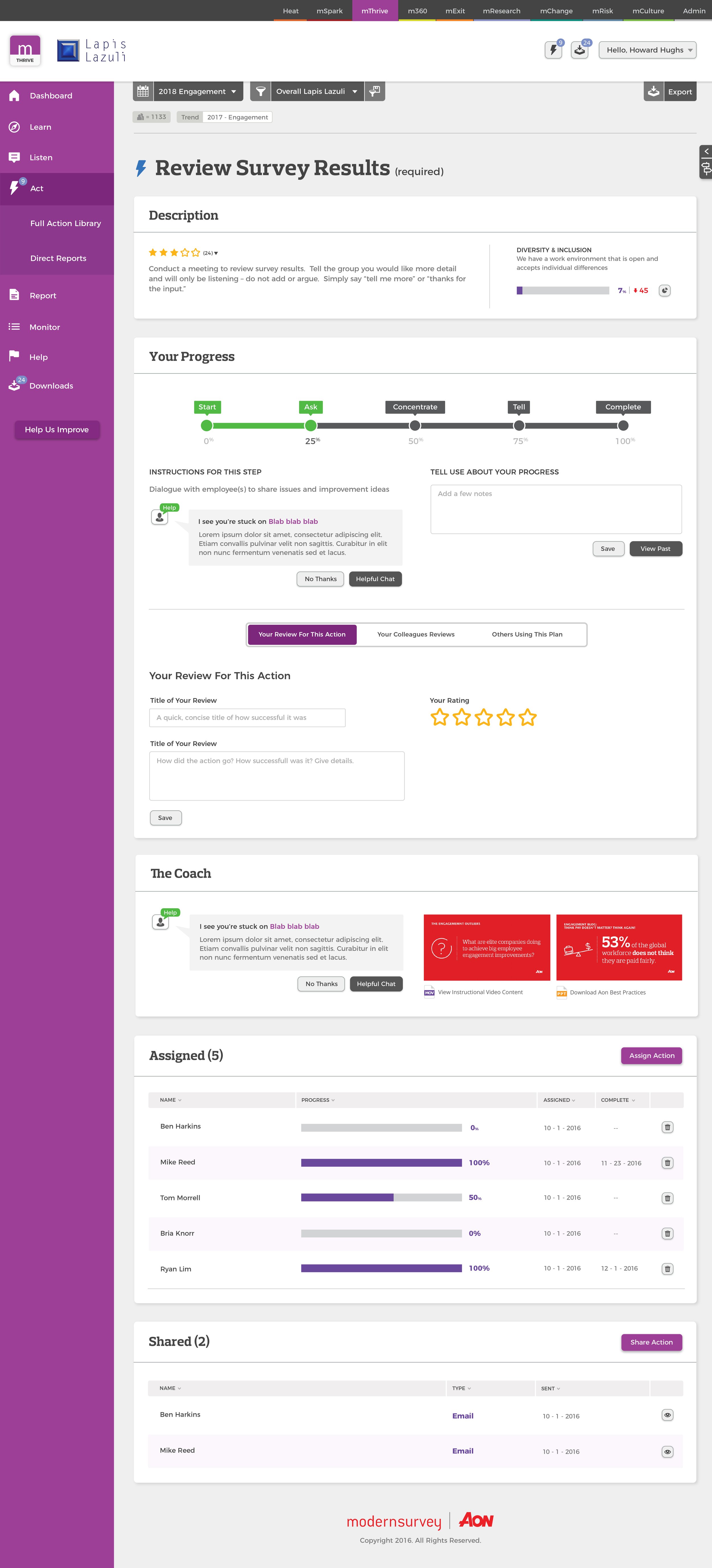
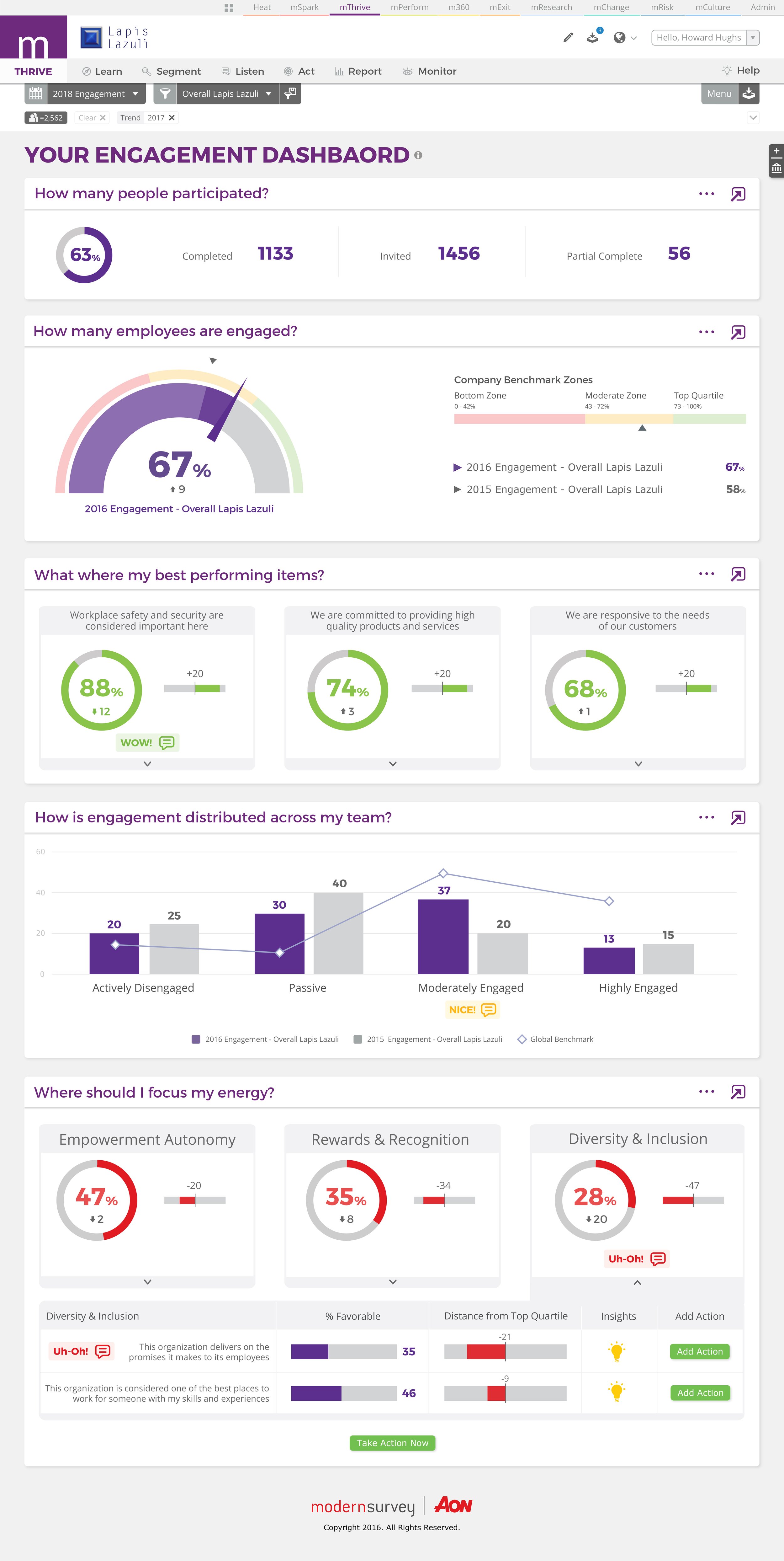
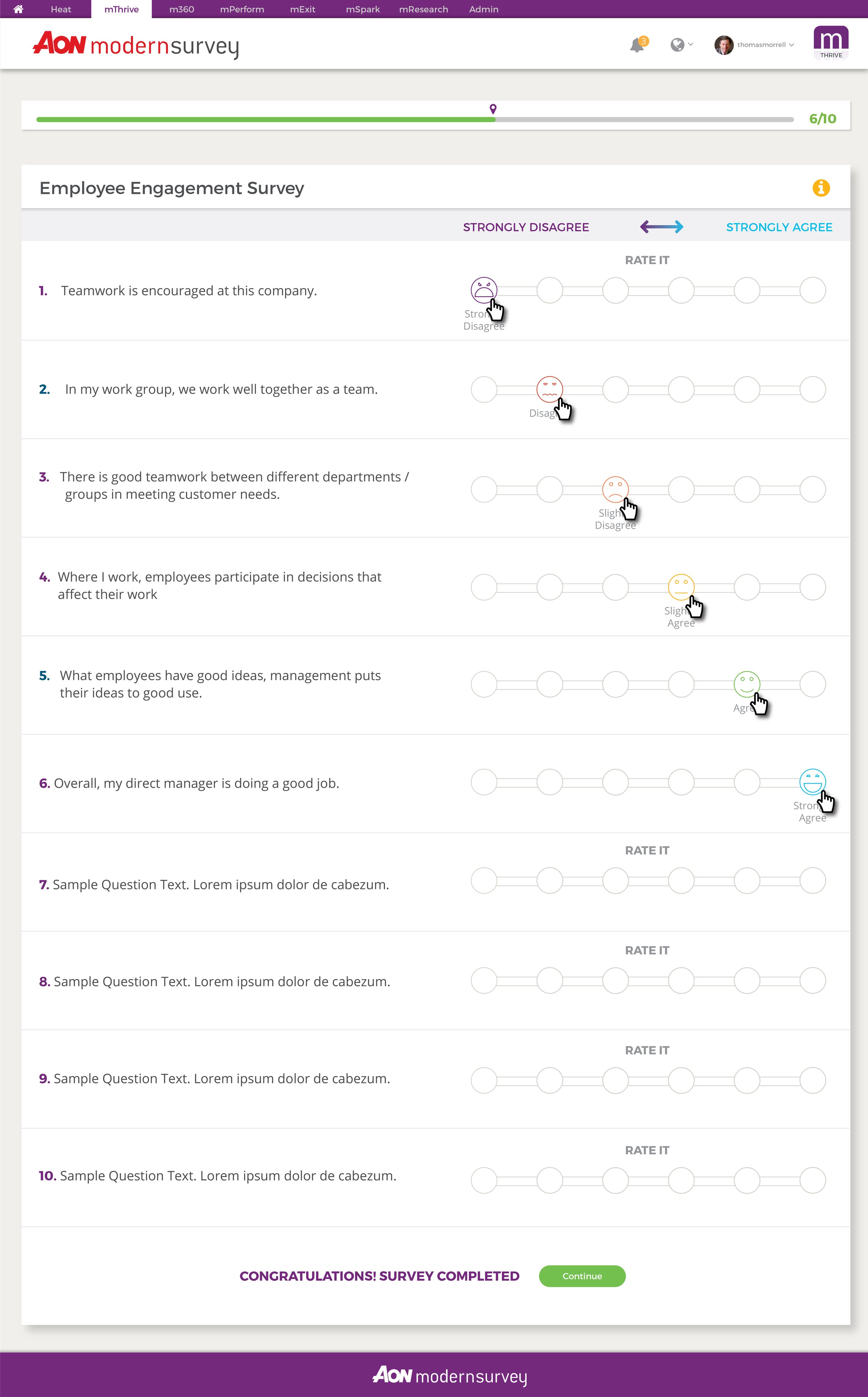
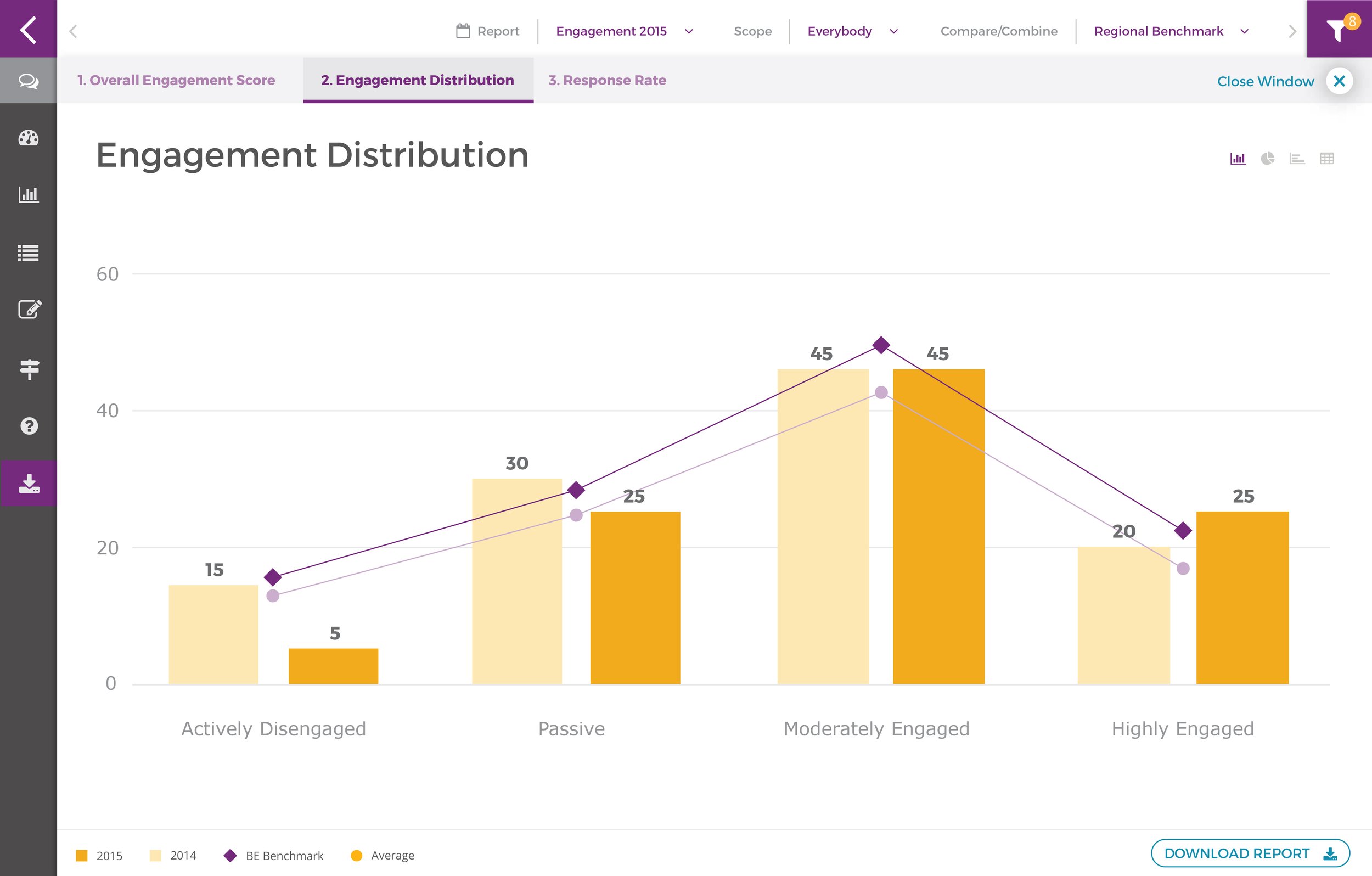
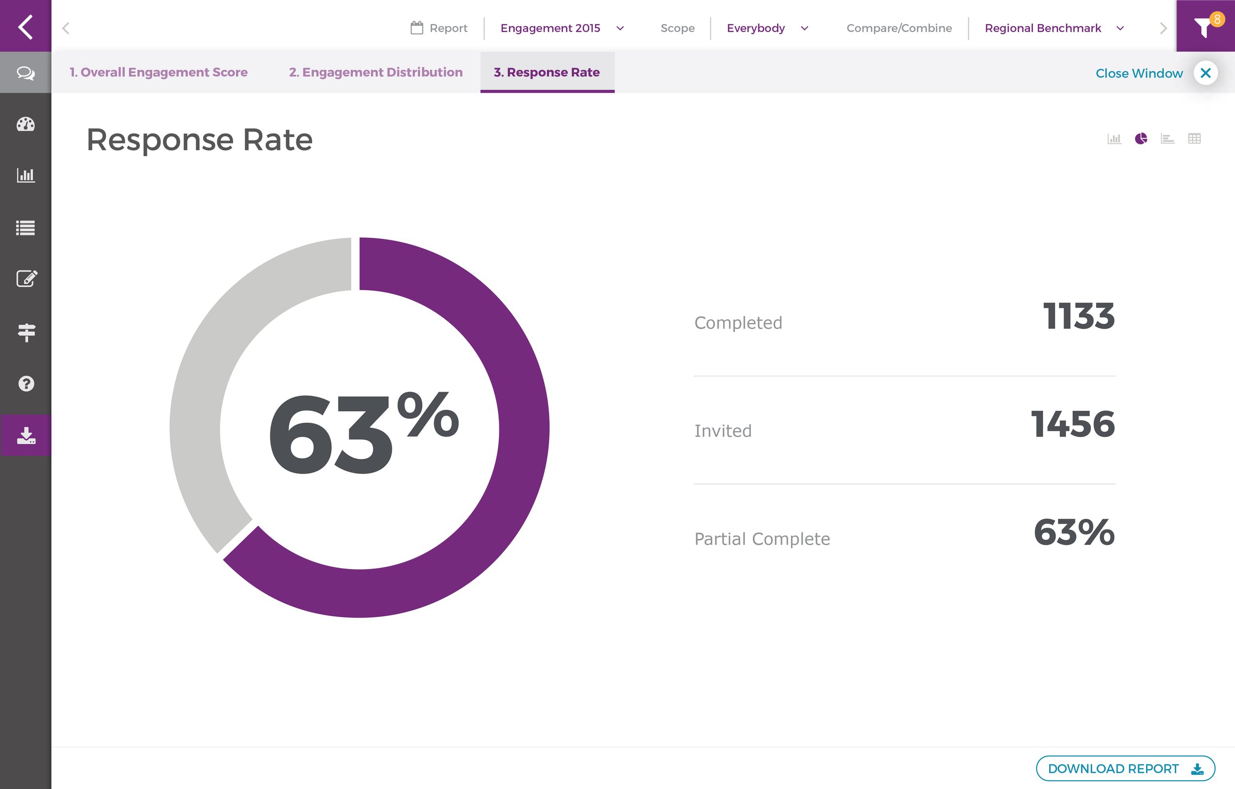
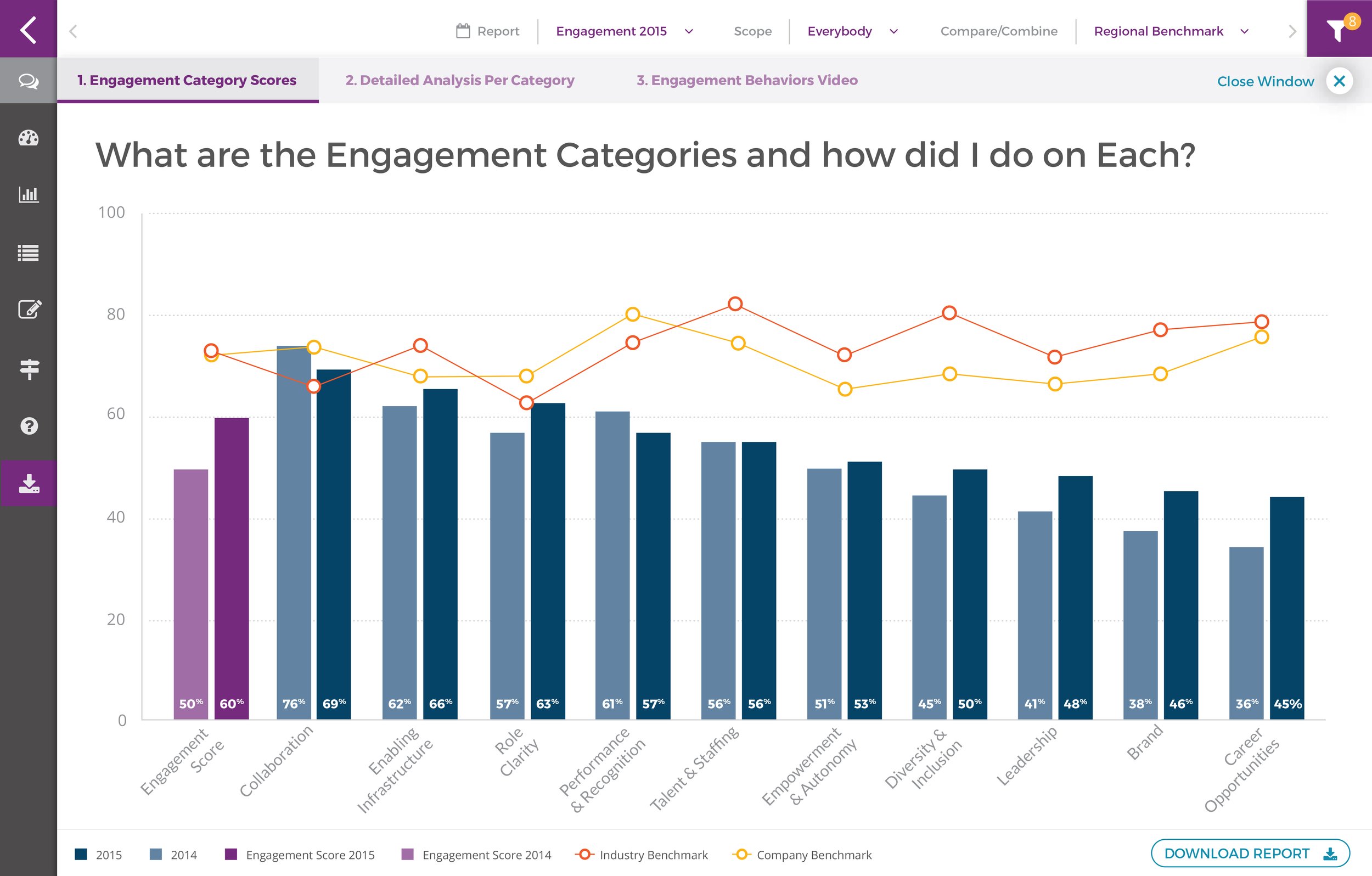
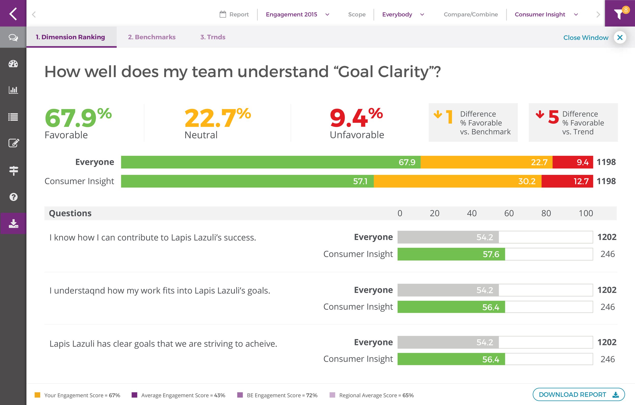
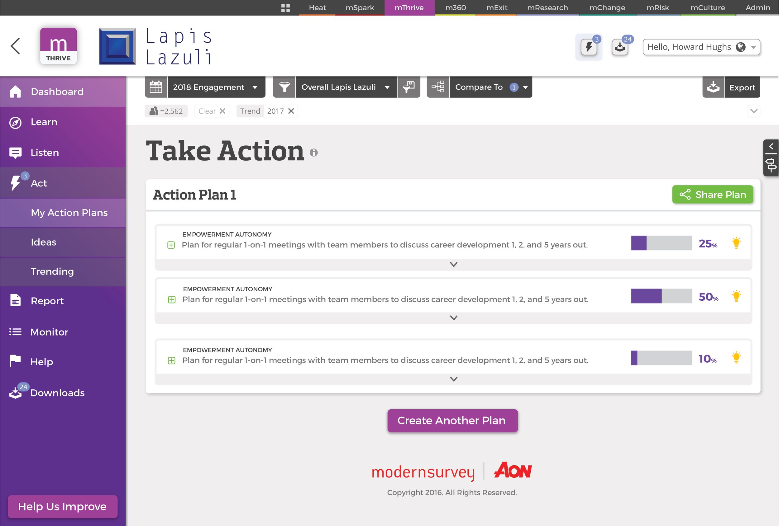
We went through a lot of design ideas and choices. These are just some of the good ideas and designs that didn’t make it into the final product.

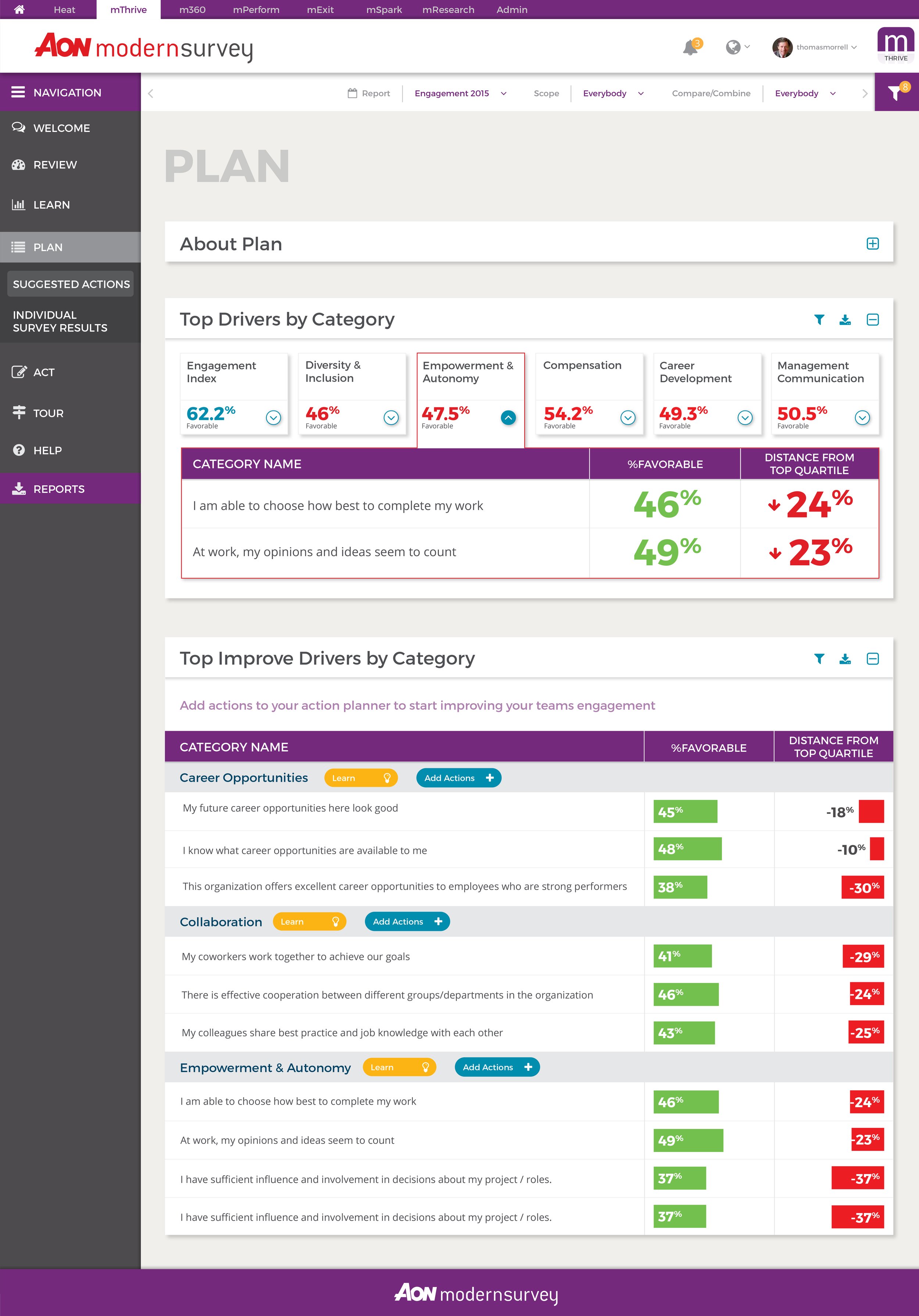

PatternsDesign System
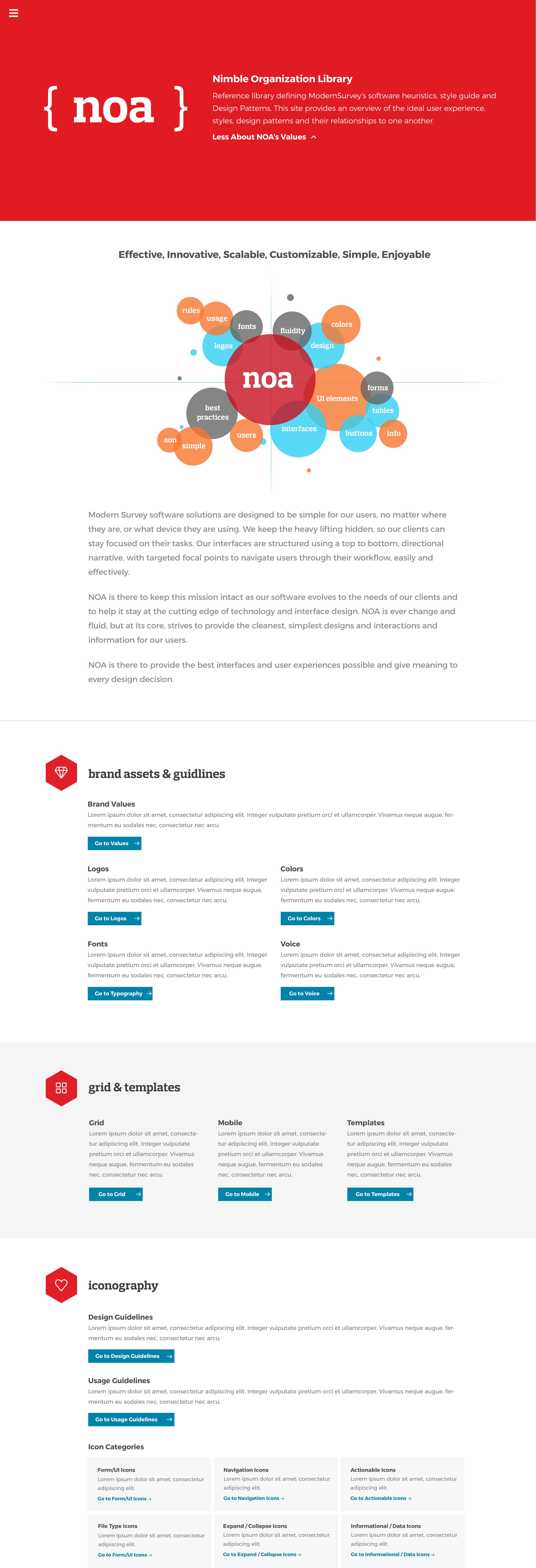
There was a lot more to this ecosystem than just this application. So to expand upon the work we had done, we created a design system “NOA” that would be used to update all the apps in the Aon Employee Engagement ecosystem.


